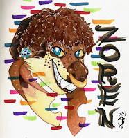
I'm beginning this blog a week in advance, so opinions may change over time. I'll be finishing this sooner than the deadline, and it's crunch time now. No giving up, no room for failure, no space for any wasted time-- all that I can do is believe in myself and pull through. Anyway, the only person who can make this happen is me.
When I began thinking for this project after being introduced to the prompt, story samples include Delle (the doe) spelunking in some ruins to find an amulet, and setting off a ton of traps in the process, to a story of self discovery, with little to no musical influence, describing River's (the kangaroo) experiences with dysphoria and finding themself through the influences of their friends. These initial ideas came from my personal experiences and my Inktober work from last October, but I believed those ideas were too loose or complex to coherently animate. You see, in the beginning, I was basing the story on the songs that I hadn't used for my independent study. In each of these songs, I try thinking of a musically driven story with these three. I've got solid ideas for Buttercup and Two Time by Jack Stauber, Still Feel by half·alive, Find My Way by Khai Dreams, along with a ton of others, some more action-influenced than others. I want to work on one of these through the summer up until February of next year for my SVA portfolio, but we'll see how far I can shoot with these ideas. Eventually, a cohesive story sprouted when I was listening to the ghostly tune of "Hypnotize" from Psychadelik Pedestrian's "Best Bytes" album; A story of revival. I really wanted to experiment with visual effects again like I did with my flour sack animation, but this time with my OCs. I thought this would be a great setup to have a hazardous situation with heavy consequences if something were to go wrong in order that my characters could embody the tension of the situation and bring it to life. I'm unsure how effective this really was, though. With the paranormal pursuit solidified, I began research on the logistics of the Ouija board, gathered references and started the storyboard. In the end, Savannah helped me with voicing Delle and the animation process was kicked into gear.
The principles of animation were more or less enveloped as a natural occurrence instead of a planned one. Arcs were used throughout this project, mostly in dialogue and transition animations along with the magic bits, to show natural movements and action, although they could've been better set up from the get-go. Staging was implemented by the establishment of Blitz's placement in the chair, but not much else helps the setup. The staging aspect in this project is briefly present but vanishes, since there's no transitionary animation between core actions. Anticipation is very apparent after River drops and the gem falls since we know that's what's going to keep Blitz alive, and once it's back in place, we're left wondering if it's working or not until, finally, he wakes up with a steady heartbeat. Straight-Ahead and Pose-to-Pose were involved when making up the magical portions of this and the general actions. The use of straight-ahead can be seen clearly in the animation of the candle in the title screen and in the "Widja Board" magic transition to show the items from Beyond. Pose-to-Pose is used when River is dragging the gem along the table. Timing is emphasized in exploring the sheer weight of the gem, as explained when River is dragging it and when it falls off of the table. Most of the weight comes from the ghostly ice encasing it, which is why it so easily flew in the air after Delle shattered the ice with her Reflect magic. Exaggeration was used in the expressions of my characters along with a few of their movements.
I think the scenes where River and Delle brought Blitz's soul-gem into the mansion from beyond worked well animation-wise, but the storytelling could definitely be clearer. I enjoyed playing around with perspective, although the background ended up as an inadvertent focus instead of the characters. These elements were inspired by the various anime-like VFX scenes I've watched over the years, and I wanted to try something new. Looking back on the setup of the story as a whole, I realize that the introduction, instead of just having them drop Blitz on the bed, could've been much better if it opened up with stills showing what happened to Blitz, then showed River and Delle running up to the mansion pushing him in the operating table and going through the doors. The hectic nature of the situation didn't shine through at all, whether it be by the expressions or dialogue or voice acting, but what could be done? We're all still amateurs, but this is just something that'll be revisited in college, maybe when my comic comes to this plot beat.
For one, time management could have been much better on my part. I spent an entire week bouncing over what the mansion and surroundings would've looked like that I was too intimidated to start animating until halfway through the allotted time. I do like that I was pushed by the talent show to get it done to a viable stage, but I will rest assured I could've done better, more, pushed myself to fail forward, to give myself an actual challenge instead of floundering for the first quarter of this project. The deadline wasn't impending, so why bother, right? I wish there were more in-progress checks from the beginning instead of waiting for the second half to begin. I don't mean to whine here, and I know this is my problem entirely, but from the critique, I noticed that nobody finished to a point they were comfortable with. Adding more time isn't the answer here, but a more guided experience might be. Allowing free reign over project timing to teenagers with the penalty of neglect being a weird look of concern here and there doesn't seem effective. To improve my personal skills of time management, I plan on making independent animations, looping or story-based, with my own set deadlines. There will be no moving them, with the only guarantee being a revision slot if it's going in my portfolio. Experimenting more with animation, whether it be short motions or dynamic storytelling, can only help me in the future. Right now, I'm working on a looping animation based on my thaumatrope. It's been a day, and I'm already near done with the lines on all frames. I'm getting there with this whole "managing myself" thing, but it's a process and I have to treat myself along it to keep up the work.
To be frank, what held me back earlier in the year was laziness. I didn't wanna draw every frame-- what, are you crazy? I took all the shortcuts I could find; hiding objects behind scenery, cutting crucial motion just to pan to another area, keeping the subject in one area throughout... This all eventually led to my failure in the independent study (I got a whole 60) because I was too focused on mentally piecing things together instead of actually executing those actions. Had I done so, I would've likely failed, but I would've failed forward, learned something new. This is, undoubtedly, the first time I actually truly "animated" a character of mine for more than 2 seconds. In my 11 second club, it was just semi slick pegging and phonemes with that one short action-transition River performed. No actual, flowing animation. This time around, it's different. I was dedicated. I could bring this to fruition. I was the only one who can actually do this for myself. Was it effective? We'll see.
Wednesday, May 29, 2019
PolterHeist; References!
Hi! This is a list of references used for my final animation project at NCTEC, entitled PolterHeist.
I'd like to begin with one of the bigger inspirations for this story so far, which is the "Reflega" magic from Kingdom Hearts II. I had recently finished KH I and II in the Winter, and so the sound effect was engrained into my mind and when thinking up the final storyline for PolterHeist, that seemed like the only viable option as for what Delle does when the gemstone drops. Although the mechanics of the KH Reflect magic are different than what I'm animating, it's still the same general concept, except instead of shooting back enemy attacks, Delle's magic acts like a trampoline, although small in size. It was only a coincidence that this lines up with her character's archetypes as a Heart attribute, one who protects, whether it be by reflecting magic attacks away or by healing wounds, she's got it covered. It might've been subconscious when storyboarding, making the scenes as "canonically accurate" to my story that doesn't exist anywhere yet, but I like where this is going.

The story was driven entirely by music beats. Specifically, Hypnotise by Psychadelik Pedestrian. I include this as a reference due to how often I went back to different parts and ruffled through the song as a whole on repeat to accurately bring this concept of mine into a storyboard. The process of making up stories for your OCs driven by songs is quite fun if you've got the imagination for it!
As soon as I thought about River and Delle searching for Blitz's soul, my mind immediately shot over to the paranormal; specifically, the Ouija board. Popular as a gimmick toy back in the 1900s, this became a source of many spooky coincidences, stories, accidents, movies, and shows that have no signs of stopping. For this project, I decided to delve into what makes ouija boards "work", and it isn't ghosts, sorry to say. Ideomotorism is the true source of power for the Ouija boards, actually! The boards rely on your subconscious actions and reactions in order to supply you with the spooks you desire. So, the next time you find yourself around an ouija board with your friends and everyone agrees to not push/pull the planchette (the piece that moves on the ghost's behalf), just know everyone is doing exactly that, even if they don't think they are. Here are some Ouija Rules to get you started!
So, we all know by now that Blitz enters the scene dead and spends all his time being lazy and relaxing on this comfy operating table that willed itself into existence in a haunted mansion. I imagine on the way to the mansion, Blitz had to be carried there by both of them, and therefore no more hands to drag this thing along. Plot hole #1, baby!!
(I realize now that these have wheels, so the plot hole has been patched. They wheeled him in on this and dropped him on it in the beginning for some reason. To check for consciousness, I imagine?)

I had no clue how to draw these characters sitting down at a table in perspective on this kind of angle, and after all of that, it's clear I still have 0 clues. perspective is a hard practice and takes time to master, along with the other elements of Illustration, so I'd like to request a formal pardon. I did, however, try using these tutorials on perspective by various YouTubers!
I took a lot of inspiration from various animations and V/SFX reels I looked over when researching this idea I had in mind. For my bigger story involving these characters, they all have magic of some sort, belonging to three archetypes; Mind (Psychokinesis, lie detector, temporary weapon materialization, hindsight, and premonitions), Heart (Healing properties, Hope, Temporary Weapon Materialization, Active Shielding, Reflective Magic among other Defensive magic, Regenerative properties), and Soul (Control of the Elements via technical Apparatus/Natural sources such as a gemstone, "Ghosting" ability, Strong Willpower, Courage). With this in mind, I wanted to push the boundaries a bit if I had extra time with the project during the magic sequence with River and Delle to better reflect their Mind and Heart paradigms.
Power Up VFX
Seb Iglesias 2d FX Reel
Magic VFX (Variety of inspo)
Magic VFX
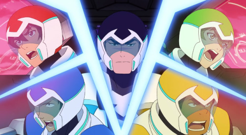
I utilized a Voltronesque split-screen layout while River and Delle were summoning the gem from the Ghostly Realm, so here's a reference of what I mean by that. Sort of an anime-like transition to show all parts of the action at once; I think I made it work quite well.
I would have used this last one had I kept the candlelight in, but animating the light seemed ambitious when there was a lot more to focus on, such as the dragging and falling animation River goes through. I do plan on polishing this up a ton during the summer, though, so it might be added back in then.
Lighting Blog
unsurprisingly, for a majority of the motion I didn't know how to animate, random GIFs online came in handy. Despite being lazy and not knowing, I didn't record any live references, I just drew them out and figured what would happen to each character's form based on the circumstance.


To keep my creative gear in drive, I revisited amazing works of animation by my idols to persuade myself to finish this to the best of my ability. These include Ghost, a song by Mystery Skulls, animated by MysteryBen27, Starlight Brigade, a song by TWRP and Dan Avidan, animated by Knights of the Light Table, and Welcome to Hell, an animation created by Erica Wester. These were huge inspirations on their own terms by keeping me going and protecting the imaginative flames in my heart.
Sunday, May 19, 2019
Chavant Structures and Cute Bear Friends!
Alright, so!
It's been a while.
How've you been doing?
--
--
This time around in BOCES Animation, we did some more probability math (easy fractions, whatnot) and I completely forgot to hand it in (whoops!) but what truly frustrated me is my progress over the weekend. Due to the obvious GoT hype my parents generated in me, we spent all Saturday and 4 hours today trying to catch up just for me (currently on the tail-end of season 6) and, therefore, what time I could utilize was spent with me shielding my eardrums from spoilers being yelled over in the next room as they watched the final kicker. Let it be known that if anyone attempts to spoil it, I will formally never talk to you again. ;]
 |
| Tuca and Bertie Screenshot |
 |
| Rilakkuma and Kaoru Screenshot |
--
--
I learned a bit more on the technical side of Harmony, utilizing nodes for the first time here. The Quake node is used once (?) in my final, and it opened up a world of possibilities for my future projects. I've got a lot of ideas I want to try executing after this, so hopefully, it'll come in handy along with anything else I can find.
--
--
I want to learn how to use the Adobe software to create the content my heart desires, but there are so many apps that it seems nearly like an epic quest in which the protagonist dies and gets revived a kajillion times only to find that they can't fulfill their destiny because someone can't bear the metaphorical weight of the predicaments of each and every combined program. I'll give Character Animator a shot though, see if I can make tangible character puppets for once. Among other things, I want to continue my extracurricular Spanish and Art studies, hopefully utilizing an extraneous AP Studio Arts-Drawing course and challenging the AP Portfolio. SVA accepts a 5 as a replacement for entry-level art classes, so here's to helping wishes I make a perfect score!
--
--
Thanks for reading!
-Ari
What Detective Pikachu Did Right
Detective Pikachu, when it was first announced back in November last year, had everyone stoked! A fresh movie with a seemingly great storyline and video game characters while maintaining the integrity of the content that inspired said movie? Hell yes! Now that people are revisiting the trailers after its release, the majority does so declare that it, in fact, rocked. Although, however, partially overshadowed by the train-wreck announcement of the Sonic movie featuring Jim Carey, the reception was that Detective Pikachu acted as a panacea for the evils the Sonic movie put in our hearts; comparisons between the two displayed in the comment sections;

Emphasis on this last one, since the implications of the remaking of Sonic means a professionally-grounded, unpaid crunch period of 5 months for the animators, riggers and texture artists. Although it wasn't their fault, we should place the blame on the artistic director and general director Jeff Fowler, of whom will take NO RESPONSIBILITY in fixing this himself, since all he needs to do is force the animators to do it. Jeff isn't going into crunch time; those he employs are. Jeff isn't going to be suffering over this, he's going to be rolling in cash. Jeff isn't going to be knocked for this, he's going to be praised for acknowledging the harsh criticism. Jeff wins here. The animators, VFX artists and texture artists get swept under the rug.
Now, back to the topic, what we'll be covering today on Blogscape Smackdown is what Detective Pikachu did right that the Sonic movie failed at. A majority of this comes from respectfully adapting from the source material. Since most blockbusters are 3D animated or assume some CG/VFX properties, we can assume that our field requires a lot of strenuous work from everyone involved, even if your Art Director is a bad man with no care for source material (Jeff Fowler); let's take a dive into the logistics and strategies.
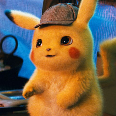
Upon the trailer's release, a similar question sprouted in everyone's minds; does pikachu have fur? As a mouse pokemon, you would think so, right? Maybe my point of view as a kid who grew up hugging pikachu plushies, those of which were furred, I always assumed that the pokemon was furred, just like a regular mouse, but apparently, people were repulsed over this? Although small in number, those utterly dejected by pikachu's furry design sparked the debate and made one question after another. The criticisms over such a small detail puts into perspective the leaps and bounds this movie has to make as the first ever live-action release from the Pokemon franchise over its 24-year-span. People have expectations, and as part of an adored series and as the mascot, Pikachu has to be cute, endearing and perfect to a majority. Adapting these types of characters is often seen as a challenge for studios, and a huge divide can be seen with the two movies discussed in this blog. Here is a side by side comparison between the source material characters and their movie counterparts.
 VS.
VS. 

 VS.
VS. 

You can obviously tell why the creepy, out of touch rendition of Sonic garnered so much backlash, right? They did an amazing job with the presentation of Pikachu that the bar was set so high, and I think what happened here is that the production team overshot it with Sonic, bringing him straight into the uncanny valley. With the directions Detective Pikachu took, they made numerous hour-long conferences just to pin down how pokemon designs work, since what may look like clothing can be organic in nature, just like a skin sometimes, which is what happened in the case of Sawk and its judo outfit. Needless to say, the team couldn't come to a sound conclusion and Sawk was cut.
Upon the trailer's release, a similar question sprouted in everyone's minds; does pikachu have fur? As a mouse pokemon, you would think so, right? Maybe my point of view as a kid who grew up hugging pikachu plushies, those of which were furred, I always assumed that the pokemon was furred, just like a regular mouse, but apparently, people were repulsed over this? Although small in number, those utterly dejected by pikachu's furry design sparked the debate and made one question after another. The criticisms over such a small detail puts into perspective the leaps and bounds this movie has to make as the first ever live-action release from the Pokemon franchise over its 24-year-span. People have expectations, and as part of an adored series and as the mascot, Pikachu has to be cute, endearing and perfect to a majority. Adapting these types of characters is often seen as a challenge for studios, and a huge divide can be seen with the two movies discussed in this blog. Here is a side by side comparison between the source material characters and their movie counterparts.
 VS.
VS. 

 VS.
VS. 

You can obviously tell why the creepy, out of touch rendition of Sonic garnered so much backlash, right? They did an amazing job with the presentation of Pikachu that the bar was set so high, and I think what happened here is that the production team overshot it with Sonic, bringing him straight into the uncanny valley. With the directions Detective Pikachu took, they made numerous hour-long conferences just to pin down how pokemon designs work, since what may look like clothing can be organic in nature, just like a skin sometimes, which is what happened in the case of Sawk and its judo outfit. Needless to say, the team couldn't come to a sound conclusion and Sawk was cut.
The technical caution presented in this case is what the Sonic movie is missing. Directive action wasn't taken, and instead, the public urged them to make changes where neglect was certain in their practice. When a production lacks that clarity, it's certain to fail. Although the changes are being made, are they being ethically and effectively made? I truly believe a delay would make everyone happy, especially since original the games played a definitive role in so many childhoods and we just want to have a fun time with the experience instead of wondering why Sonic looks to have come from eldritch horror visualizations. It's a stark contrast to how the team creating Wreck-It Ralph handled the situation of adapting Sonic. Although not live action, they nailed it. I don't get what was going through Jeff Fowler's mind during the conception of such an atrocious adaptation, but the mark was definitely missed. By about 2887 miles. (That's how fast Sonic can run an hour. Original Sonic is running away, Fowler can't catch him after this. No redemptions.)
 |
| Wreck-It Ralph edition |
There's something about big-name works like these that make me feel sad, almost broken inside. Thinking about how companies can take someone's amazing original idea and crush it to a pulp simply for an experiment or for monetary gain... it outright irks me to death. The differences presented by those in creative power here is astounding, to say the least. When something is fueled only by a name and recognition in place of passion and imaginative goals, we get something like the Sonic Movie, or a lost relic to 2010 CG animation; Chadam. Just know that WB backed it and forced it into CG from 2D to save money, failed utterly in conveying emotion and starred Leela's voice actor (Yes, Futurama Leela), Katey Sagal. It undeniably failed and was left to die. More on that one in a separate blog, there's a lot I'm not covering on the process that needs to be done justice.
Detective Pikachu's directive prowess and creative stride are what allows the audience to believe in the world presented, and the attention paid to the design and worldbuilding, both writing and animating, is what makes it so special; proof that good adaptations exist and can be executed with sash and style! I believe there is still hope for the likes of Chadam and the Sonic Movie, but what these studios need is time. Time is the most valuable resource a company or indie studio can amass, and where they spend it matters-- sometimes, if done incorrectly, can completely kill a project. Keep this in mind when working on your next passion project. Don't let yourself get cornered where you're forced to conform your own ideas into a boxy mess. Cut a hole in said box and let your creativity flourish.
Until next time, friends.
As a parting gift, here's a video on motivation.
Sunday, May 5, 2019
Weekly Comments! 5/5/19
Heya, everyone!
So basically, this week was a little bit of weird, some splashes of disappointing, but most of all mentally exhausting. Stay tuned to hear it out--
What happened last Saturday, two days ago, was the SAT. Yay! I was frustrated over studying for it since I flopped hard due to how I had no solid math classes this year. I was able to complete all the multiple choice (at least if you consider bubbling something in to be completed) and missed 4 or 5 of the grid-ins due to the timing. I did only 20 practice questions beforehand, so I guess I did well for what I expected of myself. The ELA portions were quite fun, in all honesty. I enjoyed the variety and found them to be somewhat easy, but everyone's SAT experiences differ. If you took it on the 4th, what did you think?
I have been drawing a lot more recently, or at least trying to fill up the remains of my year-old sketchbook (expires in June, I get a new one every year) and I'm happy with where I am. I still find confusion in conducting my thoughts onto the screen or sheet, but that happens to everyone. I plan on doing more motion studies and general proportion/anatomy studies along with character emotions, etc, since I have simply no grasp on mouth shapes aside from what I call the "tooth wall" (example included down below) and every time I try something new it always looks weird. Practice will get me somewhere, though, so I have to keep trying.
This week we worked more on our final projects, and I feel good about where I am in mine. I've got my primary backgrounds figured out, I have half of the staging done, a lil bit of animation here and there, I'd say I'm on a good path. Wednesday last week, I went on a college tour with a bus full of friends to Daemen college along with UB. The first stop was UB, and needless to say, I was impressed just by the size of it. Three whole campuses and each one is muy grande! Although they didn't have what I wanted (they didn't even list any art majors, although there's an entire building dedicated for the arts. It's mostly sciences, however), I still thoroughly enjoyed the experiences presented to me along the walk. The gyms have 3 floors, the auditoriums are huge, they have an Olympic size swimming pool cleaned with LED lights or something, it's a very impressive campus. After we concluded the tour there, we took a ride on over to Daemen, where we were introduced to the programs and scholarships, the whole shebang, right at the beginning in this really fancy building. I found out that two of the Animation professors have connections with CN and Disney, so there are already plus sides to going there. They offer a 5k scholarship to 2 people annually based solely on artistic skills, and I have some competition if I want to get on that level. Speaking of entry and whatnot, I'm on the fence on whether or not I actually want to take a gap year to improve or not. I know it's risky, but I'd be able to finally catch a break and work on my art and that alone. It would be a good experience, but I have yet to thoughtfully engage the pros and cons of it all since I'm a bit far from that line of action. When we entered the art building, they told us they use the same programs as us (TBH/Maya) and they have a Cintiq lab along with what they call "The Dungeon" which is basically their workspace. The seniors work on a ~2 min long thesis film, but the ones they presented seemed a tad lackluster. I want to go to a college that thoroughly challenges not only me but presses my artistic limits to promote breakthroughs. I believe I can find that at SVA. On that same topic, I plan on taking a college tour down to NYC for a day with my dad to see what it's like. I'd have all my questions lined up and ready to shoot, not missing a moment to speak up about my dream college. I want to triple/double major in either Animation, Cartooning or Illustration, all three if possible. I know that since they majorly overlap in terms of content, you'll only need to take the overlapping classes once, so it's a challenge that I'm willing to take.
I hope to learn more about expressions through art, since as previously mentioned I suffer from same-mouth-syndrome, AKA the "Tooth-Wall Curse". I notice when I look over past work that my characters either gave off blank or neutral expressions and I think I felt scared to try being uncomfortable, scared to explore new artistic territory. That's okay, but I want to stress my bits of knowledge in art to go further, to inspire not only myself but others with what I put out, to make not only myself proud, but also others around me. I know that nobody will do that for me but myself. I now know I have to get a hard, firm grip on the concept and swing a hearty home run into the stratosphere. Only I can do that for myself.
Okay, so here's what I was talking about; ft. old art from 2016-2018.
The dumb Tooth Wall.
Here it goes.


Animation Analysis; Laika Studios!
Laika Studios have made themselves extremely well-known with their blockbuster smash hits "Kubo and the Two Strings", "Coraline", and "Paranorman", among a few others. With this expertly crafted, expressive and imaginative claymation, it leaves you guessing; "How do they do it?" Well, in this Blogscape Smackdown, we will explore the animation processes, along with the work and soul poured into these films, with the aid of Jason Hellerman and his blog; "How Laika Studios Animates Their Movies" from nofilmschool.com.
The writer and director of their newest movie "Missing Link", Chris Butler, gives us a premium inside look into the massive creative outlets explored, the techniques, trials, and tribulations that are championed throughout the studio's processes. From our first source; YT channel Insider, titled "How Stop-Motion Movies Are Animated At The Studio Behind 'Missing Link' ". The video delves deep into the sheer amount of love given to every frame of their movies, showcasing time-lapses behind the scenes, impressive rigging machinery, and setups, and huge, wildly elaborate scenery to drive it all home. We discover the characters are in fact puppets, with replaceable faces in order to express a range of emotions. The main character, Link, has proven himself to be extremely difficult to animate, taking a year just to plan out his rig and puppetry, due to his shape- an avocado man with no neck. The design aspect of Link was tricky, too, as it seems, since he's covered almost entirely in hair. The team decided to settle with the same style hair as the other characters, so each bit of hair is delicately handcrafted, painted and cast onto the puppet. We see that for more complicated characters and animation, they have rigs of glorious proportions, often just to support the weight of the character. As shown by the Skeleton in "Kubo," the character proportions often translate into real life, with the skeleton having to be split into two pieces, and seeing it alone in motion is breathtaking. The attention to detail these animators, designers, and riggers put into these characters, scenes and stories leave us baffled; starstruck with the immense undertaking of creativity this studio puts forth. The team ran into a few problems with a scene involving jumping across a collapsing ice bridge. Chris explains that even with the impressive rigs, the scene alone took a year to plan out and shoot. He goes on to describe how when he was writing the scene, he was quite hesitant about the concept alone, even if it was crucial to the story just in concern to the amount of work it would take to pull off. But guess what? They did it anyway. Something else they're not afraid to do is mixing CG into the workflow. The underwater scenes shot for "Missing Link" required delicate planning in what I think was Maya, and the scenes still remained as remarkable as ever, even though they had to switch mediums here and there. This display of affection for the artistic mediums Laika utilizes proves that they are here to stay, and they have a lot in store for them. Laika Studios know dedication is required for these types of things, and they're ready, willing, and able to run the gauntlet for the star-striking effects and scenes that leave impressions on us for years to come.
In a special interview with Chris Butler, we dive deeper into the creative endeavors promoted here. He taps on how the medium of Animation as a whole, specifically in filmmaking, allows for creativity to shine through and for stories to be told that a regular live-action film couldn't dare to try, mostly due to the boundaries reality often sets forth. When we are able to break those boundaries while staying tethered to the core aspects, amazing work can definitely be produced. Laika is absolutely no novice when it comes to telling these stories. Chris expresses that even though they're making stop motion movies, they have very similar setups to L-A Hollywood movies; Lights, Cameras, Sets, etc. The only difference is that the actors are miniature puppets (often ranging from 16 inches tall to 9 or lower). He says it's more or less Live-Action on a smaller scale. The acting portrayed by the puppet characters in tandem with the VA's paints this picture clearly. Had you the chance to tour Laika Studios, Chris tells us its comparable to walking through Santa's workshop; the magical experiences unlike no other-- worlds colliding and branching off in beautiful ways.
His experiences working at Laika for roughly 13 years are unlike any other; he's worked with a myriad of creative individuals with wonderful different ideas, minds, and workflows that ultimately culminate into making each film unique in its own way. He's worked with both friends and colleagues, going through the artistic motions alongside these people, growing alongside these people and learning through both the failures and successes alongside these people. The strengths of a cohesive team that knows each and every one of each other's goals and aspirations proves worthy when working in such a large scale production since the heart of it all shines as brightly as each individual that contributed, which is what makes these films magnificent. When producing "Coraline", they decided to reach out all over the world, searching for the talent they needed when brewing up "Coraline' and the designs, ideas, and story. The diversity presented in the workforce at Laika often aids the process when bringing influence into the story, since everyone is able to chip in in some way. The casting experience is often a deep-dive into the written character's personality, story, goals, and aspirations. When hearing the audition of Zach Galifianakis, Chris describes the otherworldliness, vulnerability, and insecurity he found in Zach's voice when casting for Link. He immediately tied it to the inexperience the character had when considering what the world has to offer really struck a key with Chris, therefore leading to the casting of Zach.
I want to take this paragraph to explore the most influential film of the bunch Laika has produced, and, incidentally, it was my first introduction to the studio. "Coraline" presented to ~11-year-old Ari the potential I could find in artwork, animation, and imagination. The main character is relatable, the design is grim yet charming, and the pseudo-psychological-horror aspect tied it all together like a wonderful, expertly-crafted doll with button eyes. Black, pristine, shimmering button eyes. The paradigms of the characters along with the many interpretations of the story itself led to it becoming a staple for stop-motion in the animation industry as well as a notable figure in pop culture at the time. Rewatching the film is something you might like to try if you've got the time, it's a wonderful experience every time.
Laika studios is an amazing place to be; creating elaborate, astounding scenes, characters, stories, and situations like never before. They've definitely proven worthy as the champion of stop motion animation, and they aren't leaving any time soon. Trust me when I say that we will see them again with another decade-defining story like "Coraline" sometime in the future.
---
Link of Interest! (pun not intended)
This week's LoI is based in art school portfolios since we run into the topic tomorrow. This page explores a myriad of content, giving a deep-dive into each student's portfolio, their reasoning behind the structure, and gives each piece a loving touch of expertise. Take a look; you might find some inspiration for your future works.
Subscribe to:
Comments (Atom)


